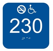
Enhancing Wayfinding: Tips and Tricks for Effective Placement of Braille Room Number Signs
Imagine navigating a sprawling hotel or a bustling office building, trying to find your destination, only to end up feeling lost and frustrated. Wayfinding plays a crucial role in creating a seamless experience for visitors, especially those with visual impairments.
In this article, we'll explore the essential tips and tricks for effectively placing Braille room number signs, ensuring a smooth and inclusive navigation experience for all.
Strategic Placement for Maximum Visibility
Creating an effective wayfinding system relies heavily on the strategic placement of Braille room number signs. By considering key factors, you can optimize visibility and ensure that these signs become beacons of guidance throughout your facility.
Let's delve into the details and explore real-life examples that demonstrate the practical application of these principles.
1. Effectively Mark Rooms:
One of the fundamental aspects of strategic placement is positioning Braille room number signs near main entrances to rooms in the building. By placing the signs in these strategic locations, you maximize their visibility and aid individuals in quickly identifying and reaching their desired destinations.
Example:
Imagine a busy hallway of similar rooms. To enhance accessibility and streamline wayfinding, Braille room number signs can be placed at 48" to 60" off the floor near each room to make it easy for anyone to know exactly where they are in the building.
This placement ensures that individuals can easily spot or feel the signs as they near the room, providing them with the necessary information to navigate the floors confidently.
2 Clear Line of Sight:
Another essential consideration is to ensure that Braille room number signs are free from obstructions. Visitors relying on tactile information must have an unobstructed line of sight to these signs to read and interpret the Braille characters effectively. By removing any obstacles that hinder visibility, you create an inclusive environment that promotes seamless navigation.
Example:
Let's envision a corporate office building with a modern and stylish interior. To maintain clear visibility of Braille room number signs, it's crucial to avoid placing potted plants or large artwork in front of the signs.
Instead, these decorative elements can be positioned in a way that enhances the overall aesthetic without obstructing the signs. This way, individuals with visual impairments can easily locate the signs and access the necessary information without any hindrance.
Remember, the goal is to create an environment where these signs serve as trusted guides, easily accessible and providing vital information to all visitors. By embracing strategic placement, you pave the way for a seamless and inclusive navigation experience, leaving no one feeling lost or disoriented.
Consistency and Standardization
Consistency in design and placement is vital for creating a seamless and intuitive wayfinding experience for all individuals. By maintaining uniformity across Braille room number signs within a facility, you establish a visual language that visitors can easily comprehend. Let's explore the details of consistency and standardization, along with real-life examples that highlight their practical application.
1 Uniformity in Size and Font:
To promote familiarity and ease of use, it is essential to maintain consistent sizing and font styles across all Braille room number signs. By adopting a uniform approach, visitors can quickly identify and interpret the signs, regardless of their location within the facility.
Example:
Use the same font style and size for both Braille and visual text on all room number signs throughout the building.
2. Logical Progression and Sequence:
Following a logical progression and sequence when numbering rooms or areas enhances navigation efficiency. By establishing a coherent order, visitors can easily anticipate the location of their desired destination within the space.
Example:
Let's imagine a convention center with numerous meeting rooms on each floor. To optimize navigation, the rooms can be numbered in a consecutive pattern, moving logically from left to right or from one end of the hallway to the other. This sequential order provides visitors with a clear sense of direction, making it easier for them to find their designated meeting rooms.
Remember, the goal is to establish a visual system that fosters familiarity and predictability. By implementing consistent design and logical numbering practices, you empower individuals to navigate spaces effortlessly, irrespective of their visual abilities.
Through the power of consistency and standardization, you pave the way for an inclusive environment that promotes independence and confidence in wayfinding.
Guiding the Way, Inclusively and Seamlessly
Effective placement of Braille room number signs is crucial for enhancing wayfinding and ensuring inclusivity for all visitors.
By strategically positioning the signs, maintaining consistency, and considering tactile accessibility, facilities can create a seamless navigation experience that fosters independence and confidence.
At Braille Sign Pros, we understand the importance of inclusive wayfinding. Our extensive range of Braille room number signs offers both functionality and style, ensuring compliance with ADA regulations while enhancing the aesthetic appeal of your space.
Explore our collection today and take a step towards a more accessible future.


Comments
Post a Comment